
The Magic of CSS Flexbox: Effortless Layouts for Everyone
A quick guide to CSS Flexbox for easy, responsive web layouts.
Introduction
Have you ever wondered how websites look so neat and organized? The secret lies in a magical tool called CSS Flexbox
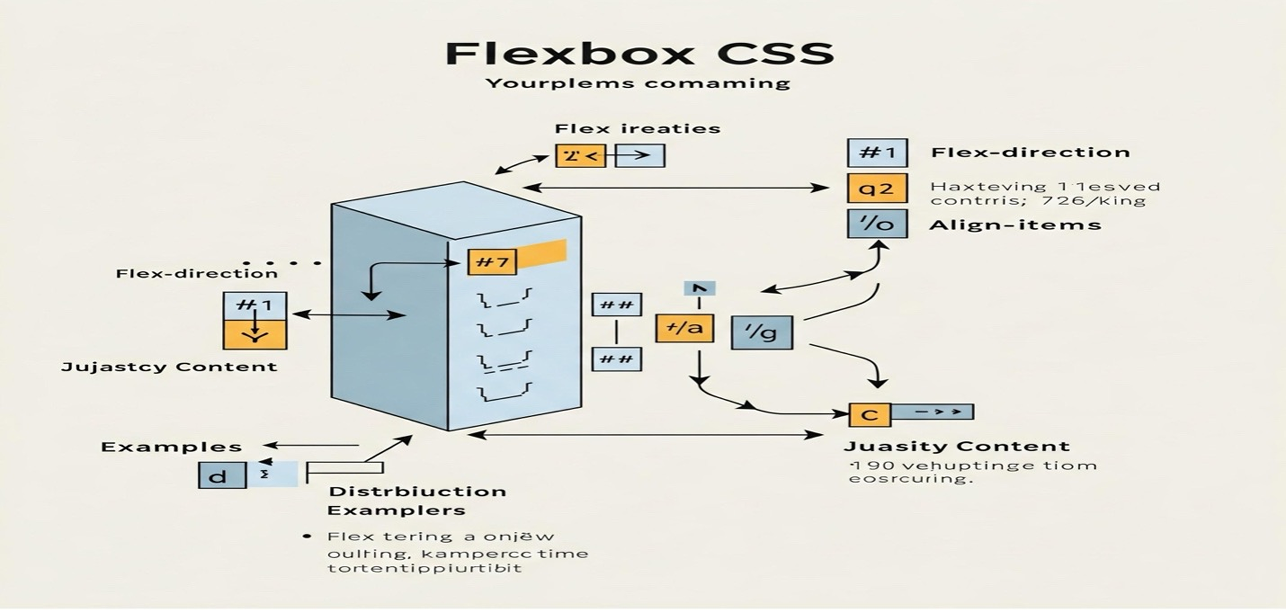
1- What is Flexbox?
Flexbox, short for Flexible Box Layout, is like a magic wand for web designers. It helps arrange elements on a web page in a way that looks good on all devices, whether it's a tiny phone screen or a large desktop monitor. Imagine being able to effortlessly place items in a row or column, and having them adjust their size and space perfectly!
2- Why Flexbox is Awesome:
a. Easy to Learn : Flexbox is designed to be simple and intuitive. You don't need to be a coding expert to understand its basic concepts. It's like arranging furniture in a room you decide where things go, and Flexbox takes care of the rest.
b. Responsive Design : One of the coolest things about Flexbox is its ability to create layouts that look great on any screen size. Whether you're browsing on your phone, tablet, or computer, Flexbox ensures everything fits perfectly.
c. Saves Time : Flexbox saves you from the headache of writing complicated code. It provides a set of simple rules that make designing layouts quick and easy. Say goodbye to spending hours tweaking your design!
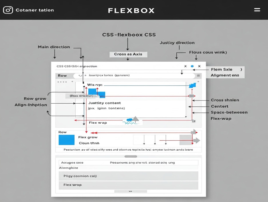
3- Flexbox in Action:
Let's visualize how Flexbox works. Imagine you have a container and you want to put items (like blocks) inside it. With Flexbox, you can:
- Arrange items in a row or column: Just like lining up your favorite books on a shelf.
- Distribute space evenly: No more worrying about gaps Flexbox makes sure everything is spaced out perfectly.
- Align items effortlessly: Whether you want items to be centered, aligned to the start or end, Flexbox has got you covered.
4- Real-World Example:
Picture a simple webpage with a header, a main content area, and a footer. With Flexbox, you can easily arrange these sections so they look great, no matter what device you're using. The header stays at the top, the main content fills the space in the middle, and the footer sticks to the bottom all with minimal effort!
5- Conclusion:
CSS Flexbox is a game changer for creating layouts in web design. Its simplicity and power make it an excellent tool for everyone, from beginners to experienced developers. By understanding the basic concepts of Flexbox, you can create responsive and flexible layouts with ease. Dive into the magic of Flexbox and start designing beautiful websites today!
Happy designing!


